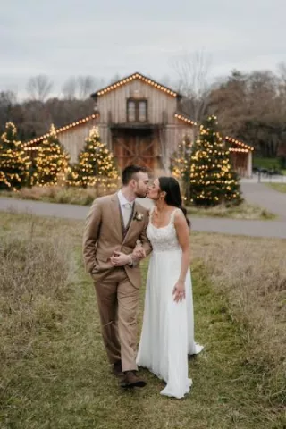
With the flood of inspiration available to engaged couples today, planning a cohesive wedding can be quite a challenge. We’re long past the days of choosing a couple of colors and moving on — now we’re carefully weighing an unlimited variety of themes, fonts, patterns, and more.
Overwhelmed by the options, more and more couples are taking a cue from a surprising source: The advertising industry. By applying the basic principles of branding, couples can hone in on the design elements that most accurately reflect who they are, allowing them to create an event that is perfectly personalized.
Ready to brand your wedding? Let’s get started!
Define Your Brand
Just as you would with a business, you’ll want to start by defining your “brand” as a couple. Who are you? What makes your partnership special and unique? How do you want to be perceived by the world? You could draw inspiration from your cultural heritage, your hometown, your interests, or just your personalities. Not only is this discussion a fun, and sometimes enlightening exercise, but it will help you define the style of your wedding day.
Create a Logo
Companies invest millions of dollars into logo design, and while we wouldn’t recommend blowing your budget on this little detail, it might be worth it to hire a graphic designer to help you translate your initial ideas into something tangible. But if you or someone you know has design skills, you’re in luck! Your logo doesn’t have to be complicated. It could be a stylized monogram, an icon that somehow represents you (a bicycle, a Boston terrier, a palm tree), or some combination of the two. The design can be implemented throughout your wedding materials — from return address stamps and menus to escort cards and favors — so make sure that you love it!
Pick Your Packaging
Once you’ve developed a logo that represents your coupledom, you’re ready to figure out the details to support it. These are the colors, patterns, fonts, and textures that will show up throughout your wedding day, and you want to be sure that they all complement each other. It may be tough to make a decision, but once you have, your design will start to come together organically — and you can stop worrying about it!
Choose Your Collateral
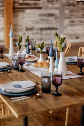
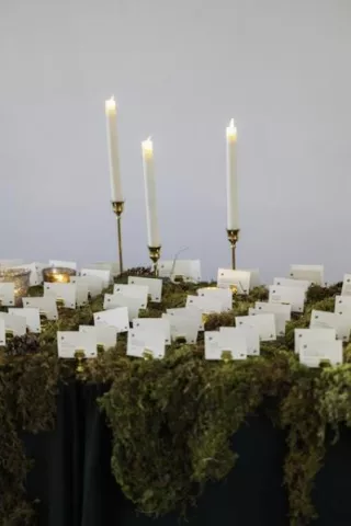
Now, how are you going to show off all of your hard work? This is when you decide exactly where to use your logo, colors, patterns, etc. You might decide to use the logo on escort cards, menus, and a light projection, while your accent fabric (burlap, stripes, floral) might make an appearance in the favor packaging and table décor. Spread it out, and make sure you don’t completely bombard your guests with your logo or design elements. Subtlety is key.
Keep It Consistent
This step is the easiest — and the hardest! As much as you may want to add more to your design — more patterns, more fonts, more fabrics! — trust yourself enough to stick with your original plan. Just like a good advertising campaign, your wedding design should stay fairly steady from start to finish.
Don’t Go Overboard
Remember, this is a wedding, not a business transaction. While using basic branding methods can help you create a cohesive design, it shouldn’t distract you from the fact that, ultimately, wedding planning should be fun. If you obsess over creating a perfectly sleek brand with logos stamped all over everything, you might end up with the opposite of what you want: a completely sterile, impersonal wedding. The most important thing is that you and your fiancé stay true to yourselves. If you do that, the rest will fall into place.
Erica Jackson Curran is the Bridal Editor of Charleston Style & Design Magazine and has written about weddings for publications including Charleston Weddings, Virginia Bride, Destination I Do, and Smitten. She has been obsessed with weddings since long before planning her own big day (without Pinterest!) in 2010, and she blogs about all things bridal for Wedding Paper Divas.
